
From Idea to Product Course | 2025
SlipPro
A visual payslip analysis app that translates complex financial data into clear, accessible insights.
UX/UI | Data Visualization | Information Design | App Design | Prototyping
The Brief
As part of the course From Idea to Product, we were asked to identify a real-world problem, one that feels personal yet can be addressed through a digital solution.
The first stage focused on understanding the need and the problem itself, without rushing toward a solution. Later, we moved into user research, insight generation, and early concept development, forming the foundation for a potential product.

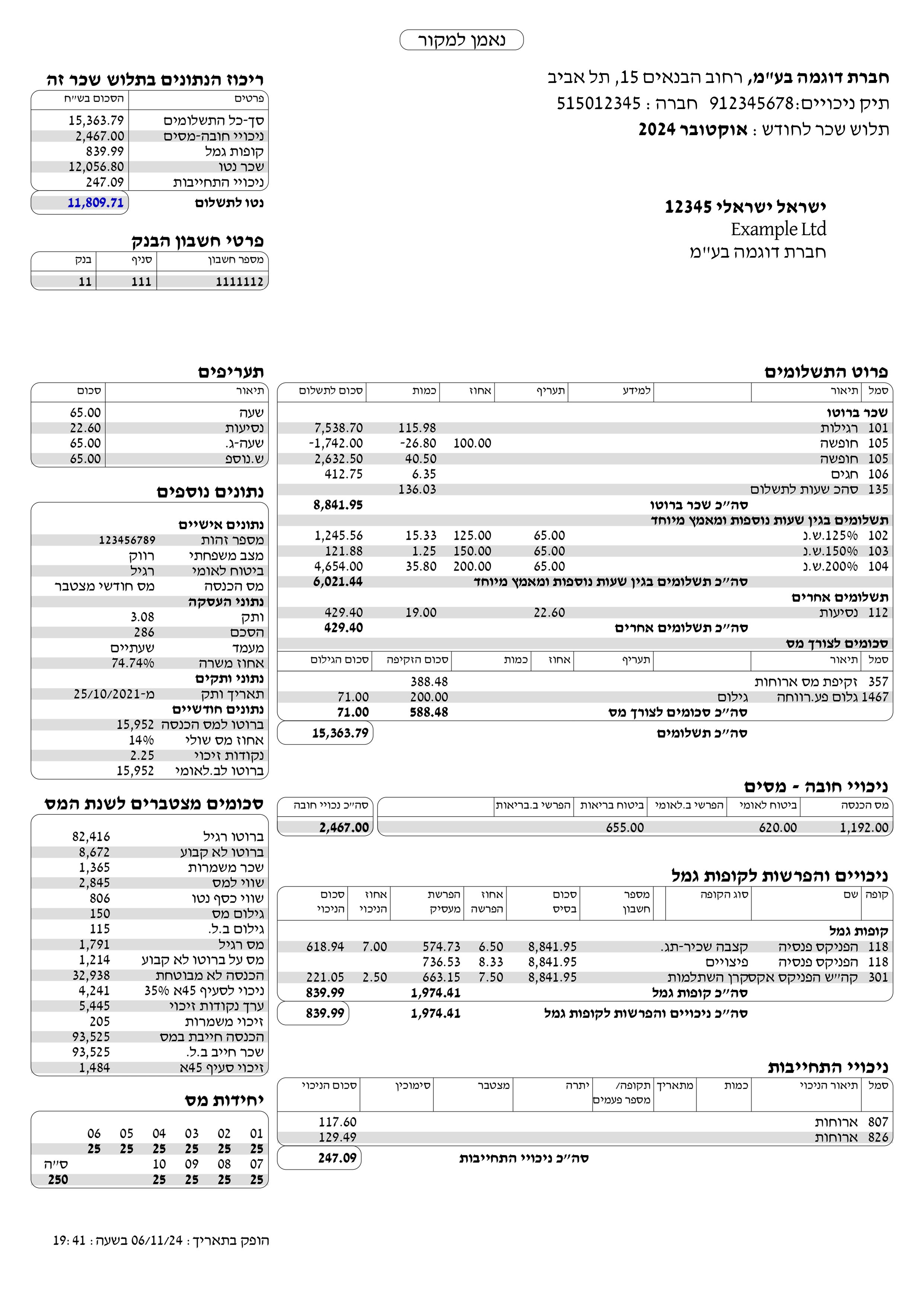
The Problem & Research
Many young people struggle to understand their payslips, identify mistakes, and manage their income wisely. As a result, they often lose rights, fail to save, and avoid long-term financial planning. To better understand these challenges, I conducted interviews with young users to uncover their pain points and the ways they interpret the information in their payslips. I also analyzed the structure of the payslip itself, identifying the key components that require simplification, clarity, and visual accessibility.
“I have a budgeting app, but it’s not enough. I don’t fully understand the terms, and every time I feel like I’m missing something” (Coral, 22)

Many young people do not understand their payslips, leading to lost rights and difficulties in managing their finances effectively.
“Every month I try to save, but it always ends up different. I know I’m losing rights or money, simply because I have no idea how to actually read my payslip” (Roei, 27)
Personal Details
Payment Details
Mandatory Deductions
Voluntary Deductions
Quick Overview

A complete user flow illustrating the end-to-end journey and highlighting key decision points.
From Insights to Concept
Moving from research to concept, I realized the problem was not only technical but also emotional and perceptual. Users needed a simpler, clearer, and more trustworthy way to understand their financial data. I incorporated familiar social media patterns, like story-style views and “like” interactions, to create a more intuitive and engaging experience that builds clarity and confidence.

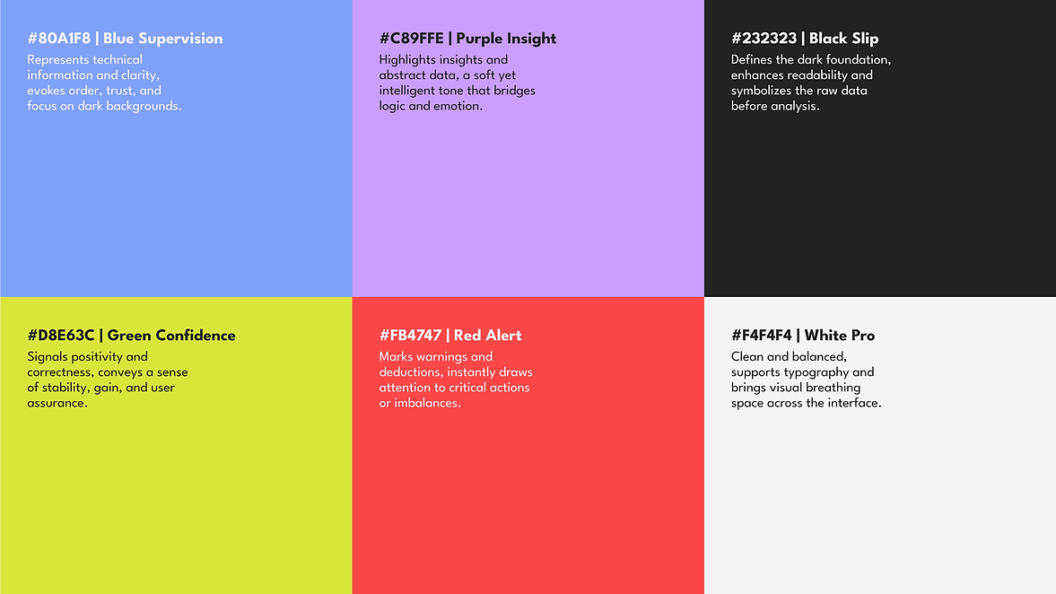
The Design Language
SlipPro’s design language balances professional stability with a warm, human experience.
The goal was to create an interface that conveys confidence, clarity, and control, even when dealing with complex financial data. The color palette is built around the contrast between Slip Black and Pro White, with clear accent colors highlighting success, alerts, and key actions.
Typography was carefully chosen to feel human and contemporary, speaking in a young, approachable tone while maintaining readability and emotional balance.

Bamberger FM
Stanga DL V2 AAA

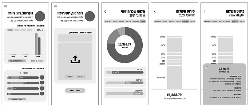
Sketches & Wireframes
Throughout the design process, I explored multiple directions to refine the visual language and user experience. I began with simple wireframes to test the flow and logic of the system, then moved on to visual sketches that experimented with color, hierarchy, and graphic balance. Through continuous iteration, I developed a cohesive visual system that translates financial data into a clear, accessible, and intuitive interface.


The Final Experience
The final product is an app that speaks a new language, clear, relatable, and built for the digital generation. SlipPro lets users understand their payslip anytime, anywhere, through an intuitive experience shaped by their own preferences. They can explore the content as stories, scroll through key points, or dive deeper into the data, all in a simple and approachable way. The app identifies moments of error or imbalance, gives users full control over their financial information, and helps them truly understand where their money goes.


