
Branding & Strategy Course | 2025
Better Me
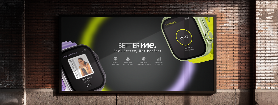
A holistic brand that combines technology and emotion through a smart watch app and complementary products.
Branding | Visual Identity | UX/UI | Product Design
The Brief
To create a fictional self-improvement brand that builds a meaningful connection with users by combining technology and emotion. The project included a full brand strategy from researching values and audiences to developing a visual and verbal identity, designing a logo, and extending the brand into products and a digital presence. The goal was to show how a brand can move from a cold technological tool to an empathetic system that supports awareness and connection.

The Idea
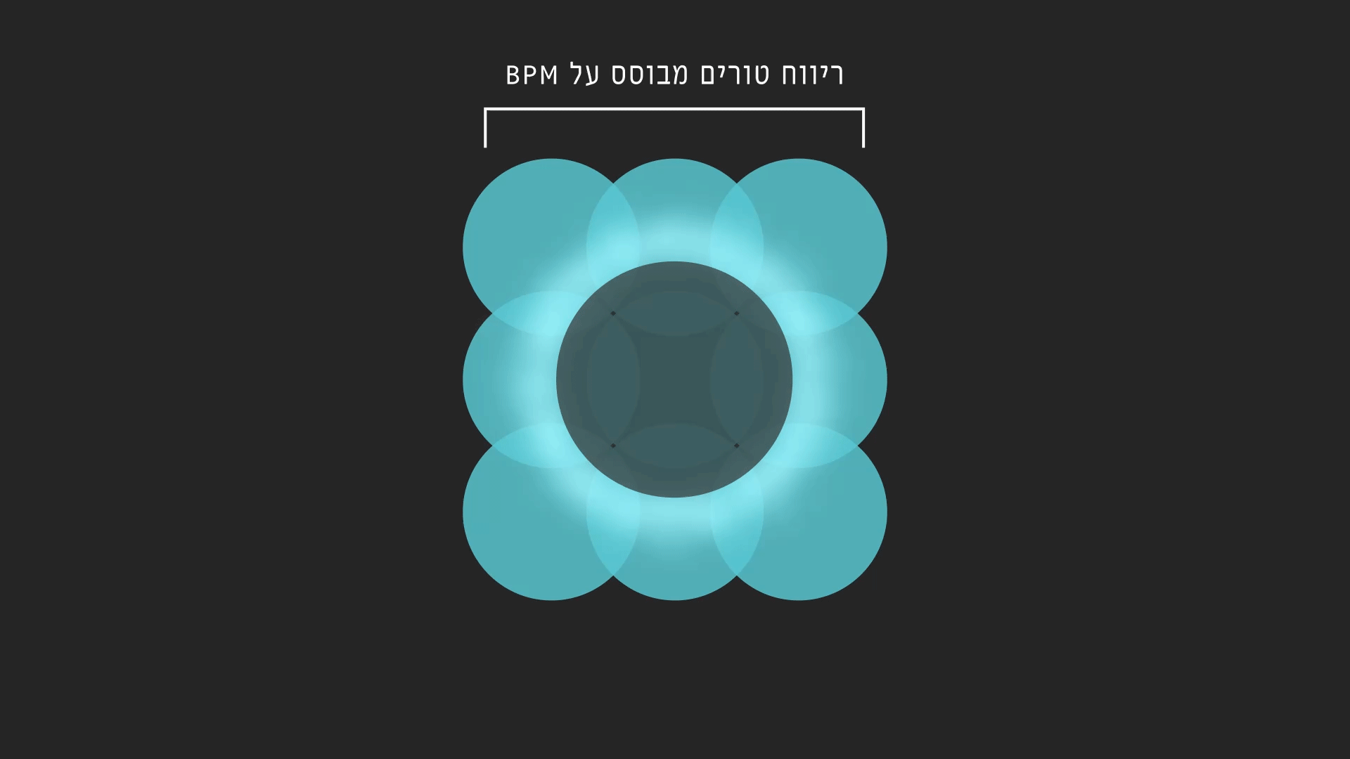
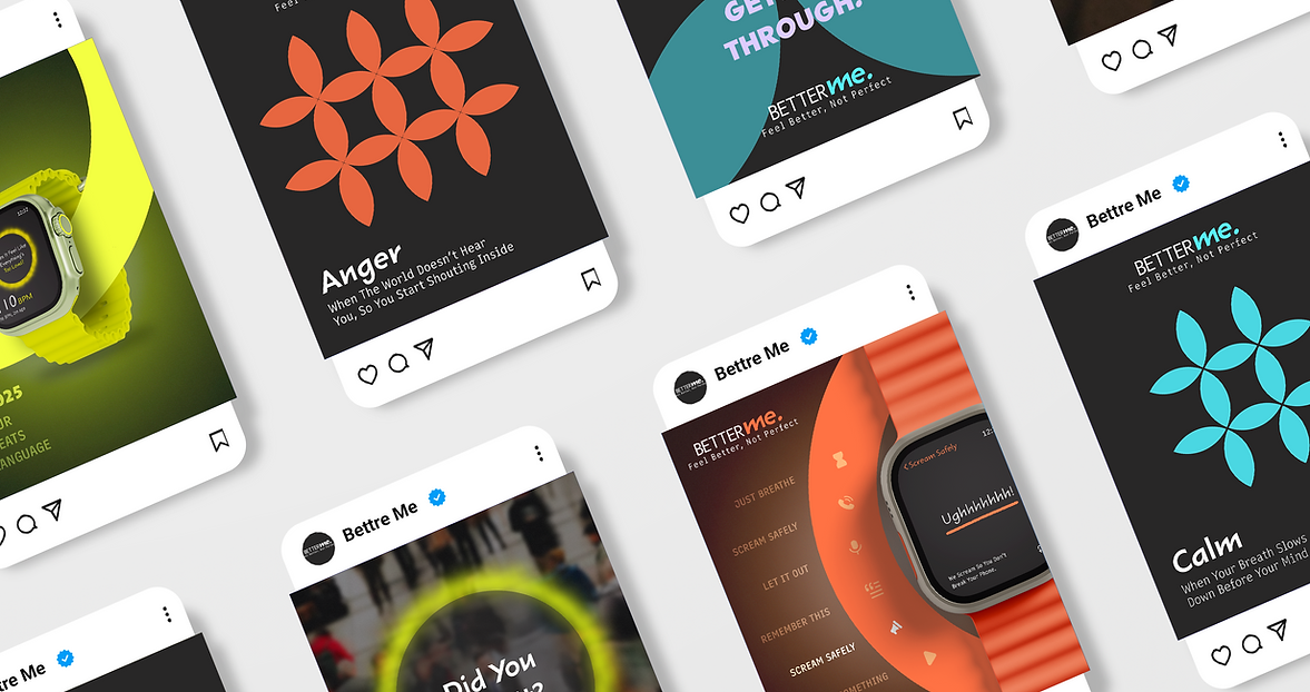
At the core of this project was my decision to focus on the world of emotions and translate it into a visual language that can be measured and understood. I chose to explore the direct connection between emotion and heartbeat, examining how physiological data (such as BPM and HRV) can be transformed into visual representations. Through this approach, I aimed to create a brand language that reflects internal feelings through tangible data, bridging the gap between abstract human experience and precise technological solutions.


Heart rate visualized across different emotional states
%201.png)
%201.png)
%201.png)
%201.png)
%201.png)
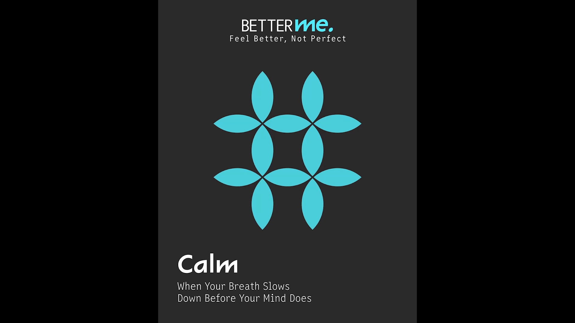
Defining emotions through the translation of data into visual shapes

Fear

Calm

Anxiety

Anger
The Visual Identity
The visual identity of Better Me translates its core values balance, connection, and science into a clean, transparent design language. Typography blends a free, human touch with precise structure, while colors express emotions: light blue for calm, purple for fear, orange-red for anger, and neon green for anxiety. Circular forms and glowing halos reflect heartbeat rhythms, creating a system that balances human sensitivity with scientific accuracy.


Sharktooth
Narkiss Yair


The Outcome
The outcome was a holistic brand that bridges emotion and technology, turning human experiences into a consistent design language and delivering a seamless presence across physical and digital touchpoints.


A calming kit with three products, each offering scent, texture, and a gentle reminder to breathe.

A notebook to write freely, track your feelings, and find a quiet.

Emotional postcards with phrases that comfort, normalize, and remind you you’re not alone.

A smart lamp that changes color with your emotions a small light reminding you to feel.


The Brand Book
The project concludes with a brand book that brings all elements together in one cohesive system.